Summit Montessori
Project
A Montessori in Missoula, Montana split into two separate schools and we was tasked with creating the brand identity for Summit Montessori. They needed their brand to be incorporated into signage and a website as well.
Goal
After a discovery call, it was clear that the two guiding words were "academic" and "simple". Summit Montessori focuses a great deal on achievement, so we knew a colorful and playful logo wouldn't quite fit their brand, though it would fit their audience. We wanted to make something that represented growth and a safe learning environment.


Design Process
This first round of logos was centered around mountain imagery. The owner loves the outdoors and wanted our beautiful Montana landscape to be in the logo. After this exploration, they realized that they wanted the logo to be more achievement based and to be more studious.
For the second round of logos, we took the word “Study” and “Academic” and thought we could visualize that through books or pencils. Here we used some abstract ways of showing a pencil while also pairing it with mountains or a sun.
Final Logo
The final logo was comprised of a book, a mountain range and a sprout. After the second round of edits, the owner discussed that they would like a plant of some kind in the logo since they deal a lot with gardening and the outdoors. I found a great solution and way to pair all of these together and used a green earthy color palette as an ode nature as well.


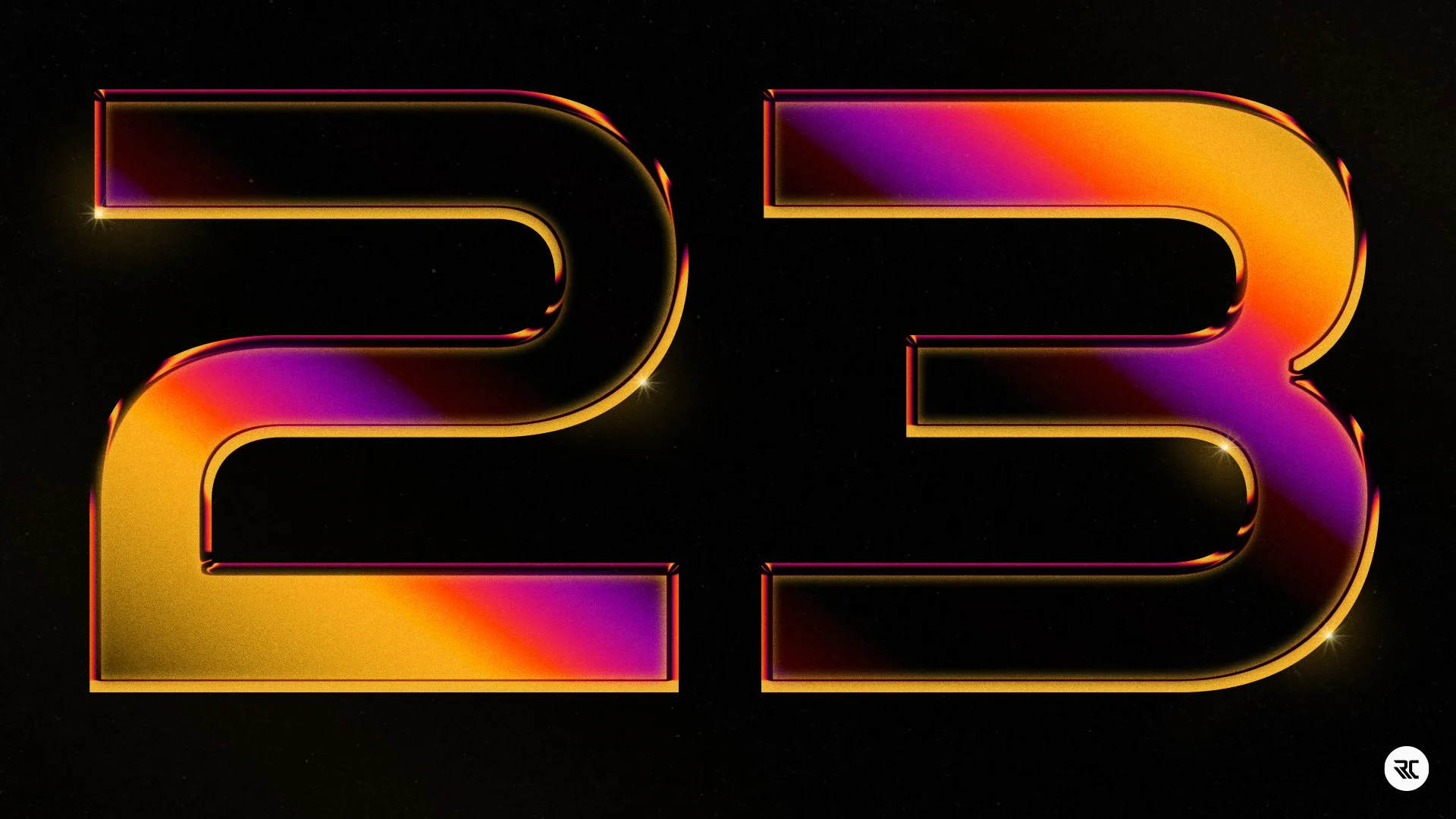
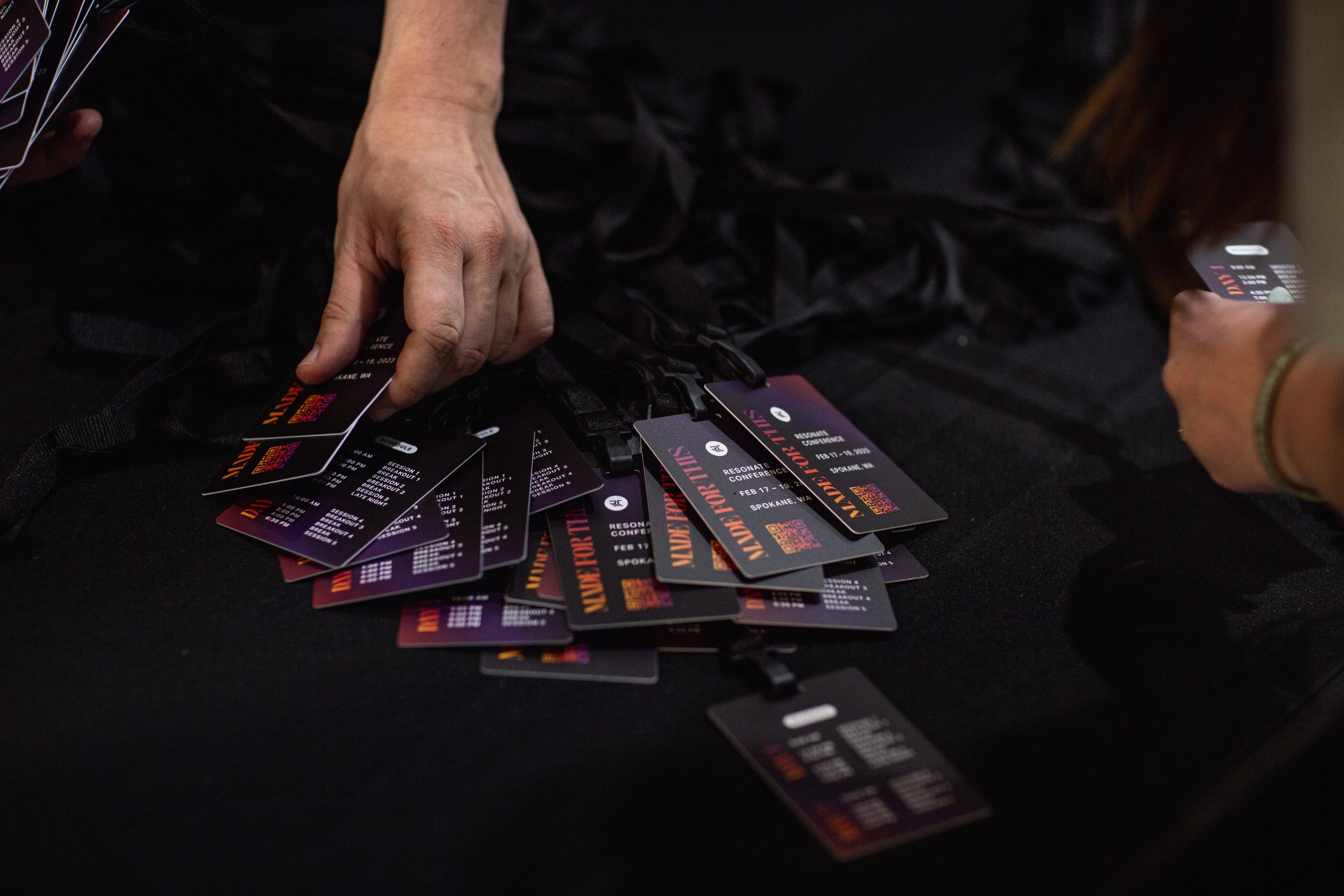
Resonate Conference 2023
Project
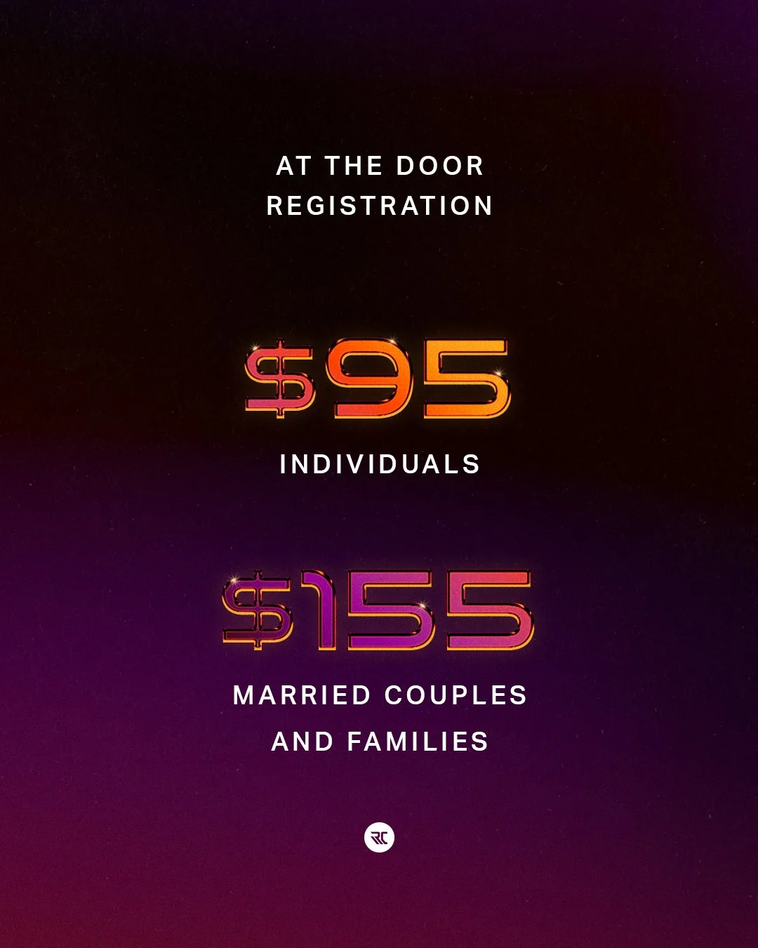
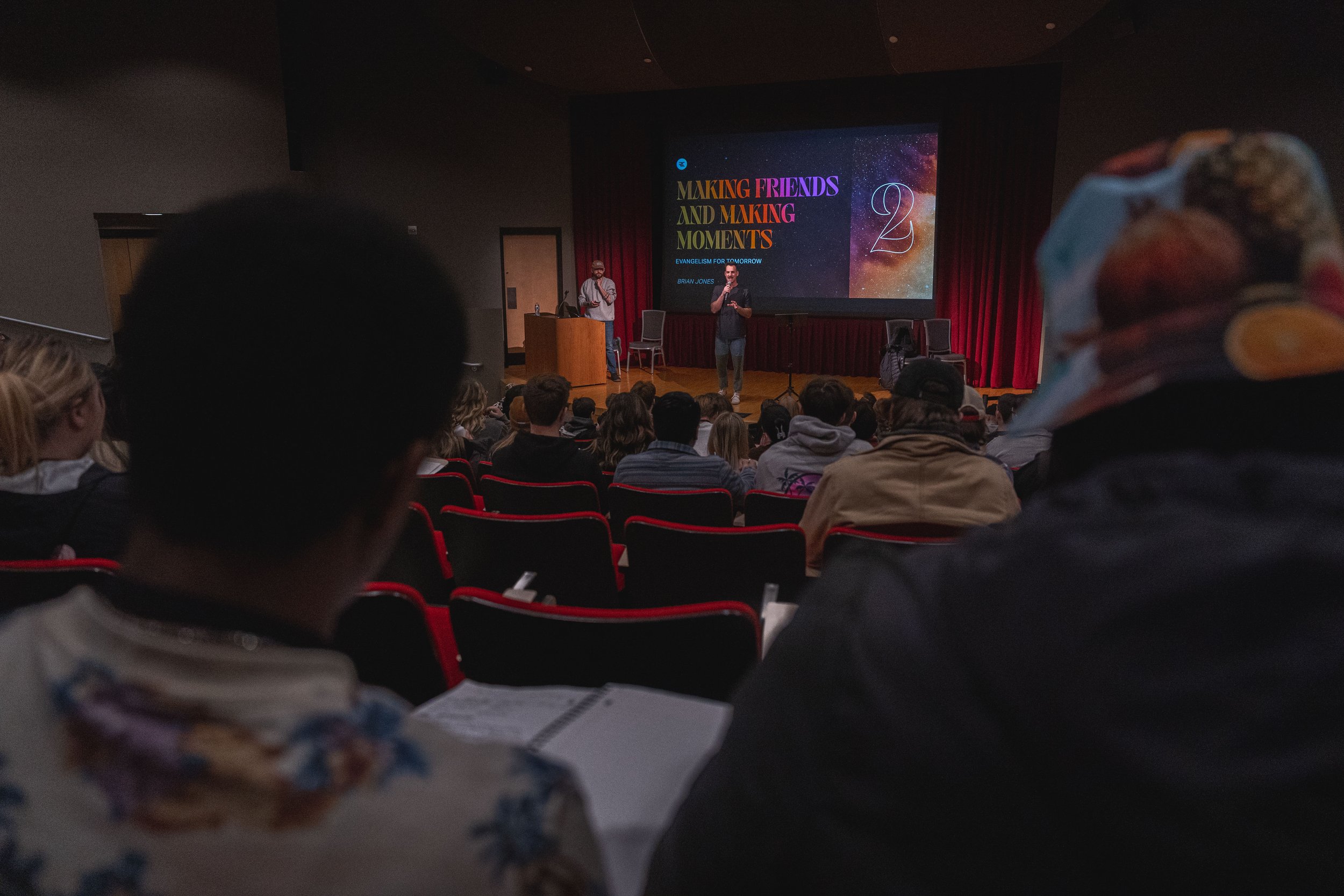
Resonate Church hosts a conference every year where 800+ college students from all around the northwest gather. We created the visual theme for this conference and established guidelines for their team to follow. There are many deliverables for this event such as: study guides, lanyards, slides, videos, stickers, merchandise, social media posts and more.
Goal
We wanted to make something that was easy to use in all of those deliverables ranging from digital to print. We wanted the visual identity to be eye catching but not too loud and to balance the feeling of a professional gathering with a young collegiate audience.
Visuals before content.
At the end of the previous years conference, we released a visual theme for the year 2023. We didn’t know what the content of the theme would be, but we wanted to give something visual for people to hold onto after the conference. We also needed a way to promote the following year, while not knowing what the theme would be for a few months. Below, you will see some of the promotional graphics we made to create excitement for the following year.


Adjusting for content theme
After all the promotion had been made, it was time to transition to the visual theme that fit the new content. This years conference, the theme was “Made for This”. The goal was to discover and explain how God made you and what he made you for.
After creating the promo, we wanted to keep a similar feeling so the new visuals wouldn’t feel like something completely different, but also feel fresh. To do this, we took the main colors of the promotion graphics and incorporated it into the new theme. We also chose a typeface that was more condensed and could fit more letters than the promo typeface.


Merchandise


Merchandise was made for both the conference, and for other projects the church has in the summers.


Montana West
Project
We worked with a client to develop a logo and visual theme for their brand “Montana West”. They build and rent out homes in Montana and needed a logo and social media campaign to get them started.
Goal
The aim was to design a logo that included outdoor elements but with a modern touch. After observing the beautiful residences built in the area, we wanted the logo to convey a sense of luxury within a rugged natural setting, reflecting a high-end travel experience, while being close to nature.


Explorations
We wanted to create a geometric logo that reflected both the landscape and the letters within the business name. Here are some explorations of the letters “M” and “W” and forming them into mountains and peaks.


Typefaces
For the main logo font, we thought Eskorte did a great job of showing the mix between modern and traditional. It mainly does this in its terminals where it looks like a crossover between a serif and a slab serif.
For the body type, we chose a typeface that felt both rugged and modern. Pill Gothic is a sans serif with some hard angled characteristics as seen in the lowercase “a” and “g”. This typeface fits the “Mountain Modern” feel that this business is targeting and is very legible.


